1. i turned in three rough sketched concepts to the art director Alexandra Zsigmond (who's great) and we chose this one.

2. the editorial department nixed the middle finger so i replaced it with the raised "WTF" arms, and drew the whole thing out.
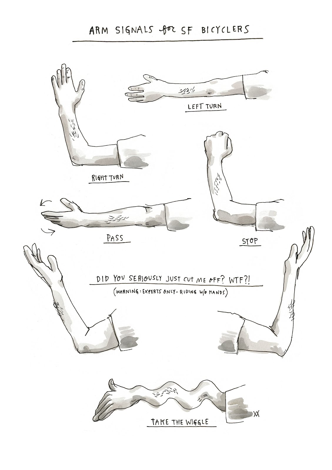
3. Alexandra thought the arms took away from the wiggle punch line, and the layout was too vertical, so we nixed the arms completely, added some color, and corrected my grammar.

and that's that.
you can see how it looks/reads in the layout here.
this series about SF in the NY Times will be running for the next month and i'm doing all the illustrations, so check back for more.


4 comments:
!!!
Rad stuff (as always), Wendy.
I think the WTF arms deserve their own piece.
:) A bit different signs than the ones we use here (Copenhagen, Denmark).
WTF is the same though :)
I love these, though the signal for “Stop” is arm down, not up. Otherwise, it’d be too hard to distinguish from “Right Turn.”
Post a Comment